Celestial Cycle
Illustration • Visual Design • Concept Development
Celestial Cycle is a visual design project inspired by space, astronomy, and repeating natural patterns. The goal was to create a cohesive set of graphics that explore motion, balance, and rhythm through celestial imagery.
Project Overview
Celestial Cycle explores the relationship between motion, time, and repeating patterns found in space and nature. The project focuses on creating a series of visual designs that use circular forms, symmetry, and layered elements to represent cycles and continuous movement.
The process included concept sketches, digital illustration, color experimentation, and layout design. Each stage helped refine the visual style until the final compositions felt balanced and unified.
Project Details
- Role: Designer & Illustrator
- Tools: Adobe Illustrator, Photoshop
- Category: Visual Design
- Year: 2025
Design Process
Interviews
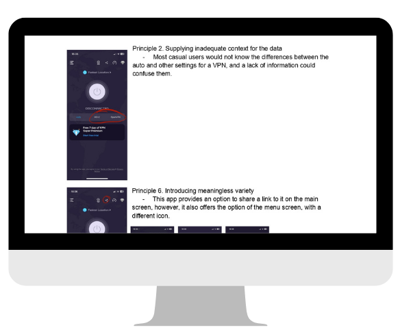
I completed research into different sleep tracking apps to understand how they use visual design to represent data and user insights. I analyzed the use of color, layout, and iconography to see how they communicate information about sleep patterns and cycles. This research informed my approach to creating a cohesive visual identity for the Celestial Cycle project, which also explores themes of cycles and patterns.
Research
The project began with visual research focused on space, astronomy, and geometric patterns. Inspiration was gathered from celestial charts, planetary motion, and repeating natural forms.
User Testing
During user testing, I shared early design concepts with peers to evaluate visual clarity, balance, and overall composition. Feedback focused on how easily the circular layouts could be understood and whether the layered elements felt organized rather than overwhelming. Based on this input, I adjusted spacing, simplified shapes, and refined color contrast to improve readability while keeping the sense of motion and rhythm that defines the Celestial Cycle concept.
Concepting
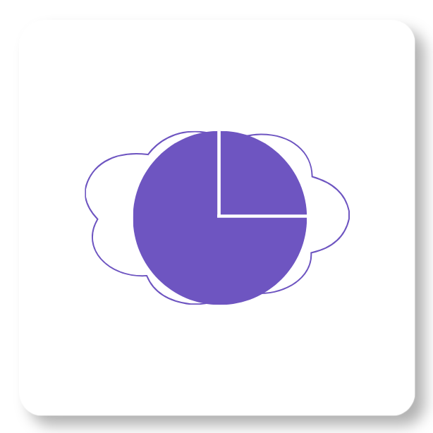
Logo
The logo development process explored different ways to represent cycles, motion, and balance using circular forms. Early sketches focused on simple geometric shapes that could be combined to create a symbol inspired by planetary rotation and repeating patterns. After testing multiple variations, the final logo was refined to feel clean, symmetrical, and visually connected to the rest of the project’s celestial theme.
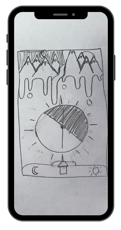
Workflow Sketches
Early concepts were sketched to explore circular layouts, layered shapes, and symmetrical compositions before moving into digital illustration.
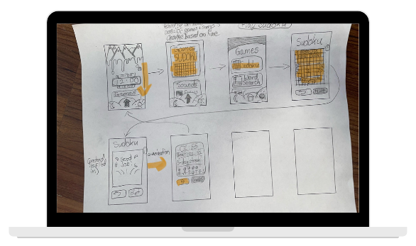
Framework
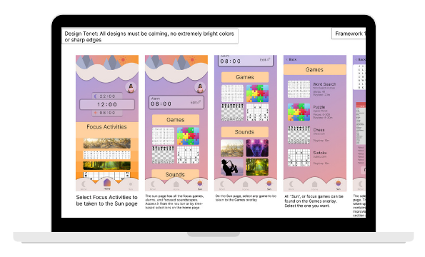
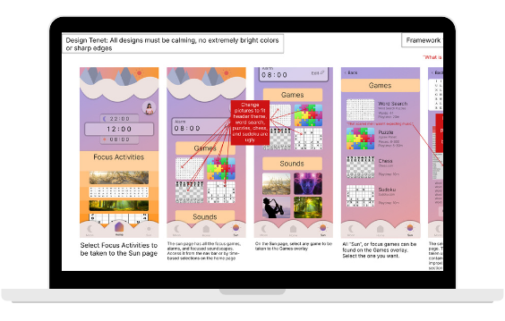
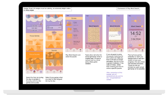
The framework stage focused on building structured compositions that could support the repeating circular elements used throughout the project. Different layout grids and alignment systems were tested to find a balance between symmetry and visual movement. Establishing this framework made it easier to create multiple designs that felt consistent while still allowing each piece to have its own variation.
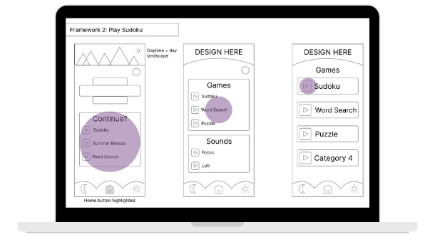
Prototype
In the prototype phase, the strongest concepts were recreated digitally to test color, layering, and overall composition. This stage allowed me to experiment with gradients, overlapping shapes, and different line weights to see how the designs would function as finished graphics. Prototyping helped refine the visual style and ensured the final pieces felt cohesive when viewed together.
Iterations
Several iterations were created to explore different color palettes, shape combinations, and levels of detail. Each version adjusted the placement of circular elements to improve balance and create a stronger sense of continuous motion. Through this process, the designs became more refined and visually unified while still keeping the experimental feel from the early concepts.
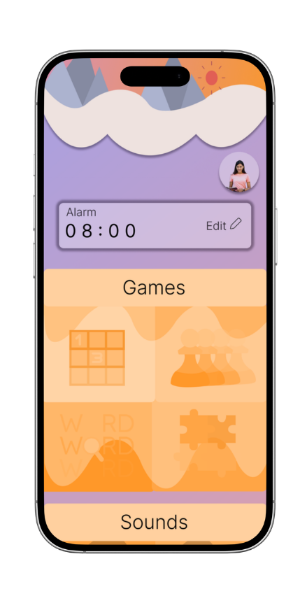
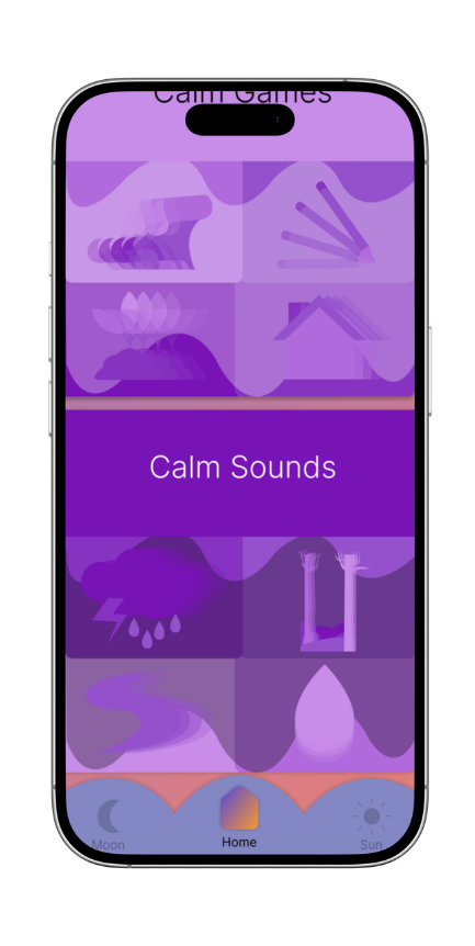
Gammified Workflows
The gamified workflow concepts were created to explore how repeating cycles and visual progress could be represented in a more interactive way. These designs use circular paths, layered icons, and step-by-step movement to suggest progression over time, similar to levels or stages in a game. This approach connects to the overall theme of cycles by showing motion, repetition, and completion in a visual format.
Final Design
The final designs bring together the strongest elements developed throughout the process, combining circular structures, layered shapes, and bold color to represent motion, balance, and repetition. Each composition was refined to feel visually connected, using consistent spacing, symmetry, and rhythm to reinforce the idea of continuous cycles found in space and nature. Gradients and overlapping forms were used to create depth, while the repeating patterns help guide the viewer’s eye around the design in a smooth, flowing motion. The finished series reflects the original goal of the project by translating astronomical inspiration into a cohesive visual system that feels dynamic, balanced, and unified.